
Morning Glory is a coffee shop in Manchester with a strong visual identity of its own, built around owner Zack Hipps’ signature yellow and a playful nod to the city’s iconic symbol – the bee. Waxman Architectural was brought in to help bring that identity to life through tile.
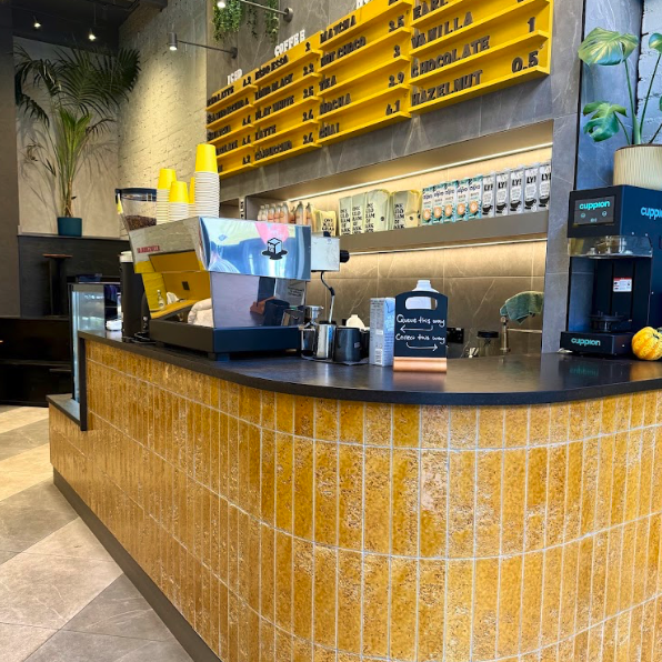
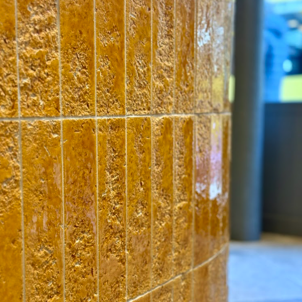
For the bar, Burano Amber tiles were chosen for their honeycomb-like texture, giving a finish that closely echoes the look of a beehive. It’s a fitting choice on two levels: it ties in beautifully with Hipps’ signature yellow running throughout the space, while also nodding to Manchester’s own worker bee emblem – the same symbol found across the city’s trams and buses – making the bar as much a piece of local storytelling as it is a design feature.
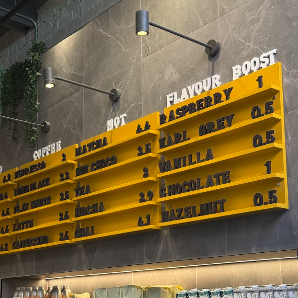
For the floors, the Creek Stone range was selected in two different tones of grey, laid in a diagonal pattern that both echoes the era-defining energy of the Hacienda and visually widens what is a naturally narrow space. Behind the bar, another shade of Creek Stone was used on the wall to create a more neutral, darker backdrop – one that lets the pops of yellow throughout the café’s interior really stand out.
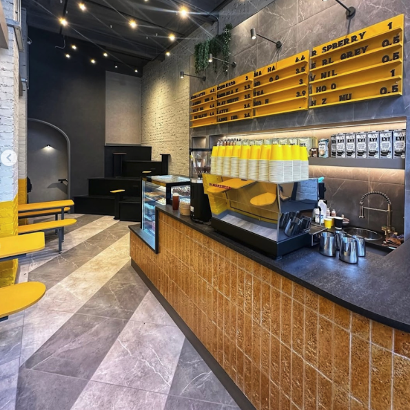
We loved seeing the Morning Glory project come to life, from the honeycomb detailing on the bar right through to the clever use of tone and pattern underfoot, and it’s a great example of how tile can help tell a brand’s story as much as it shapes a space.
Interior Design – Blackthorn Design Studio – Louise James